
The What Works Network is six years old and growing. The evidence comparison toolkits produced by the centres that make up the network are used across the UK to inform policy decisions and guide practitioners such as teachers and police chiefs. But putting these resources together and making them comprehensible is not easy.
My open-access review from last year highlighted four components that make summarising evidence and its policy implications difficult: interventions can affect multiple different outcomes, different segments of the population may be affected differently, impacts may vary over time; and there may still be some considerable uncertainties around the evidence we have at our disposal.
My team recently designed an evaluation to understand how effectively the centres were communicating evidence and learn more about what effective communication looks like.
We designed a survey that would help us understand how decision makers used the toolkits and whether they accurately understood what information was being communicated. Just over 450 people took part, contacted through seven What Works Centres and Conservation Evidence (a related evidence portal). The participants clearly stated their highest priority when using the different toolkits was understanding evidence of effectiveness (i.e. how well an intervention works) and evidence quality (i.e. how solid the scientific evidence is behind the ratings). Fortunately, the major toolkits already focus on these two features, like this from the Education Endowment Foundation:
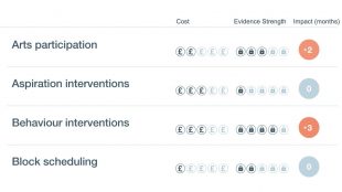
Figure 1. An excerpt from a current What Works toolkit. Copyright: Education Endowment Foundation (2019), used with permission. Full EEF Toolkit.
The toolkits rely on a series of icons to communicate with users. But what’s the clearest icon for concepts such as quality and effectiveness? What shapes is it best to use? Should there be numbers or symbols inside?
As well as getting answers from current users of the sites, we repeated our survey on over 200 members of the general public. The two groups had the same priorities, preferences, and comprehension of different icons. This is good news, as further development of toolkit features can be tested on the general public first, who are easier to reach than policy-makers.
What users want to know
Most toolkits give an overall assessment of the evidence behind an intervention and allow users to click through and see more granular information. Participants consistently expressed a preference for a more detailed breakdown, for example different outcomes by subgroup (such as gender) and different types of outcomes (compare with the single rating from the EEF above). Some toolkits provide this information. Some do not. When designing toolkits and reports, it's good to keep these preferences in mind. But a balance needs to be struck. There is a danger to making summaries too complex, which will lead to lower engagement and understanding.
We also found that practitioners (who are delivering policies and services on the ground) and policy makers (who are deciding which policies should be adopted) had slightly different needs. Although both wanted to know the effectiveness and quality of evidence around different types of interventions, the next two priorities for policy-makers were the financial costs and the potential harms of the policies. For practitioners the next two priorities were more detail about the evidence quality: the number and type of studies.
The best graphics to use
We showed dozens of icons in current use to participants in a random order, and gave them 12 options to label each one. For example, what might this icon mean?

Figure 2. The microscope icon was best understood out of all the icons in its category across the What Works Network. It is not in current use, but several Centres are considering it. Designed by Luna 9; CC-BY free-use license.
The microscope icon indicates evidence quality, and that was correctly picked 63% of the time, which was the highest of all evidence quality icons. The best-performing graphics used unambiguous, relevant shapes, color cues, and indications of quantity.
![]()
Note: Each item had the same 12 response options, e.g., 'effectiveness', 'evidence quality', etc. The microscope icon is not currently in use; all other icons are from current What Work Centre toolkits and reports.
What Works Centres and other communicators can look at our full survey results to see which icons were best understood across the different Centres. More generally, we hope this project will encourage further evaluation and testing of how the Centres communicate. That could be of the content or format of their communications, but should always start by identifying the target audience and asking what they want and need to know.
In sum, reports and toolkits with these icons are currently driving major policy decisions. This report is the first objective evaluation of comprehension for What Works evidence reports, and perhaps the first evaluation of any such toolkit summary. The main thing we learned is what people want to know (effectiveness and evidence quality) and how well they understood the current graphics (not very well).
Learn more
- Explore the scientific manuscript describing the results.
- Read an open-access review of what makes communicating policy decisions difficult, and how it's currently done.
- Read our blog on Creating a What Works toolkit to find out more about communicating evidence via toolkits.
Leave a comment